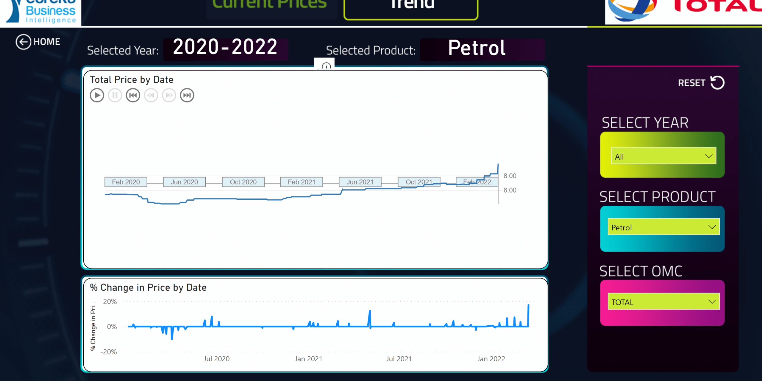
In recent times, due to the increase in fuel prices, commuters and riders have been looking for the fuel station to buy the cheapest fuel. To help myself also navigate in these times, I decided to build a simple dashboard for my daily use.
First was to scrape indicative prices, from the NPA website (thanks to my colleague Albert Simpson) for that speed work.
With the data ready, I had to ask the following questions to help me build an intuitive dashboard:
- How will this dashboard be used? It will be used on the go so it has to be quite intuitive.
- Who was going to use it? Obviously myself and anyone trying to compare fuel prices. My user persona was definitely going to affect the design.
With these questions answered, I had to get to the content and that also required its own set of questions.
- What is the prevailing price of fuel for each OMC?
- Which OMC had the lowest prices.
- What has been the trend of the prices for each product and each OMC?
- What has been the percentage change in pricing over the period?
With these questions, I could then start work. This has been the Eureka routine of telling stories with data whenever we have an opportunity to build insights from the data. I have made use of this dashboard on the daily and I hope the dashboard helps you too.


5 Comments