Imagine this: You go for a health check-up and your physician sits you down and tells you that you weigh 90kg and then he walks away. What exactly does a 90kg mean? Are you overweight or are you at just the right weight? Or imagine being told that your temperature was 36°C and being given a handshake. Should you be concerned, happy or worried with such information?
Context is very important when reporting any data or KPIs.
I often hear numbers being thrown about on the airwaves with either very little context or none at all. Let me give you another example that highlights the precarious nature of numbers with zero context. Imagine being told that your favourite team scored two goals in a match. Should you be happy? Should you celebrate or should be worried? If there’s no information on the other team’s performance, how do you determine if this is good or bad news? Only being provided with a number is not enough to give insights on what has happened. Without context, numbers could very easily lead to wrong conclusions by the end user.
It is always important to give context. Consider the same football analogy, other information such as the number of goals scored by the opposing team or the past performance of your favourite team would be useful to understanding what the two goals by your favourite team means. Context in this case makes raw numbers mean something and leads to a proper interpretation thus a much more meaningful conclusion.
This literacy is needed on our airwaves. When numbers are mentioned, without context, they are likely to lead to incorrect conclusion.
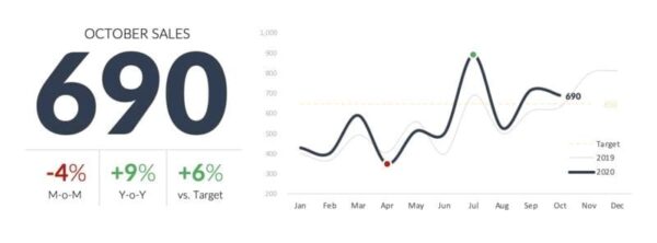
Here is another example. Assume you are given an October 2020 sales figure of USD690 and then asked to assess the sales company’s performance based on this piece of information. You can very well appreciate the difficulty in doing this.
By adding context however, one can tell a much more meaningful story and therefore give a better assessment. Assume now that you are given further information for context: the sales had dropped a bit for the month in question but were still above target and better than last year. We’re seeing an upward trend in 2020 but still well below our July high. Based on seasonality, we can expect a strong November/December sales. This provides a more global picture of how well the company may be faring, making an assessment much easier.

data analytics – context
So the question then becomes, how do you provide context when presenting data? What kind of background information is needed to ensure that our data is properly interpreted? The kind of data you are providing matters, however here are a few simple ways to kickstart you journey into better data/KPI presentation:
✔️ Measure against comparable periods
✔️ Compare against targets or benchmarks
✔️ Show trending and seasonality
✔️ Compare against highs and lows
At Eureka BI, we fully understand the importance of context in interpreting data. This forms a central part of what we do, we take full consideration of the context in which we operate to ensure that our analyses are as precise as possible.
We know full well how easy it is for the public to be swayed by data without context or how easy it is for advocates and stakeholders to misrepresent data with the hopes of swaying the public. Eureka BI would be addressing issues such as these and many others in our 5-minute Power BI series.
Subscribe to our YouTube channel and other social media pages to get notifications when videos are uploaded


Hi there! Would you mind if I share your blog with my facebook group? There’s a lot of folks that I think would really appreciate your content. Please let me know. Many thanks
You may share the blog on your facebook.
This wonderful piece surely add to my knowledge on building better reports.
Thanks a million…